Making the Most of Big Data in a 5G World
 Learn how Dell EMC can help service providers navigate this new data-intensive world to operate more efficiently and profitably.
United in Build. Come See Us at Mozfest and Start to Connect the World.

Builders, creators, inventors, and tinkerers – we can start to connect half the world. Meet us at Mozfest.
Around 3.5 billion people do not have Internet access, many of them living in remote locations. How can they share the benefits of this amazing resource?
Tackling the digital divide is not easy, but everyone can help. Community networks are a great way to get involved.
What Are Community Networks?
Community networks are a global movement. From Asia with the Wireless for Communities project to the Tusheti region of Georgia and Rhizomatica’s initiative in Oaxaca, Mexico, community networks are examples of how to build, empower, and sustain communities of people. By communities, for communities, with communities.
Sound awesome? Find us at Mozfest
If you love the Internet, you’ll love Mozfest. This year you’ll be able to learn about community networks. First, visit us at the Science Fair. We’ll be featuring an interactive exhibit of photos and videos of community network projects from around the world.
From Zimbabwe to Georgia find out what it took to build each community network and why they are so unique.
There will also be a workshop where you can learn how to build your Continue reading
Introducing Spectrum with Load Balancing
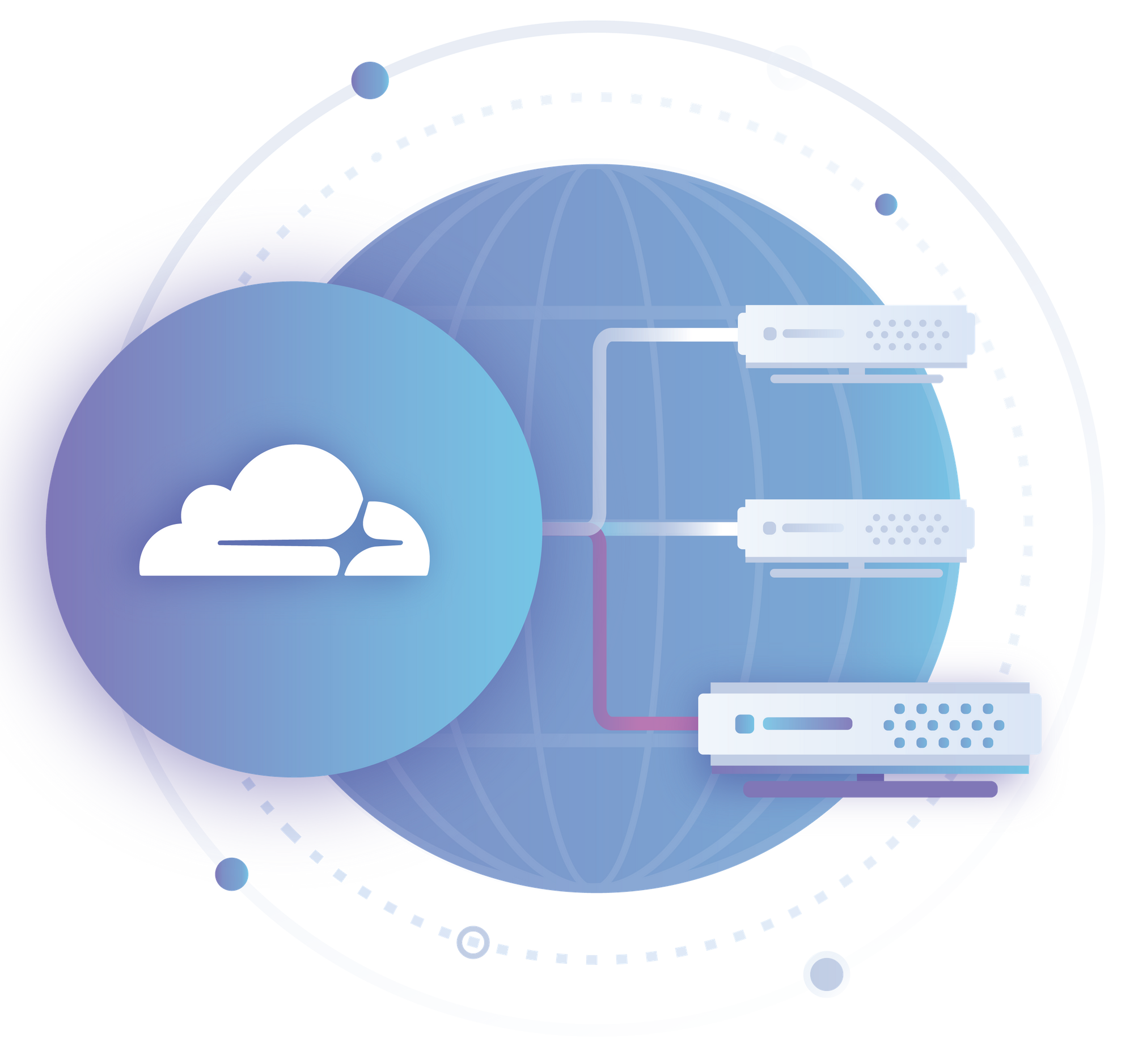

We’re excited to announce the full integration of Cloudflare Spectrum with Load Balancing. Combining Spectrum with Load Balancing enables traffic management of TCP connections utilising the same battle tested Load Balancer our customers already use for billions of HTTP requests every day.
Customers can configure load balancers with TCP health checks, failover, and steering policies to dictate where traffic should flow. This is live in the Cloudflare dashboard and API — give it a shot!
TCP Health Checks
You can now configure Cloudflare’s Load Balancer health checks to probe any TCP port for an accepted connection. This is in addition to the existing HTTP and HTTPS options.
Health checks are an optional feature within Cloudflare’s Load Balancing product. Without health checks, the Cloudflare Load Balancer will distribute traffic to all origins in the first pool. While this is in itself useful, adding a health check to a Load Balancer provides additional functionality.
With a health check configured for a pool in a Load Balancer, Cloudflare will automatically distribute traffic within a pool to any origins that are marked up by the health check. Unhealthy origins will be dropped automatically. This allows for intelligent failover both within a pool and amongst Continue reading
Keynote address from Tim Cook to European Parliament
Passionate advocation for privacy by Tim Cook as the voice of Apple in this speech to European Parliament.
The post Keynote address from Tim Cook to European Parliament appeared first on EtherealMind.
Preparing for the Intent-Based Network
Today’s emphasis on speed and agility has led to the advent of the intent-based network, an infrastructure of a higher order, powered by software that enables the network to learn, adapt, and evolve.
Join Us: Immerse Yourself in Networking and Security at VMworld Europe
We are looking forward to a fantastic show at VMworld 2018 Europe. We have a ton of great content on networking and security to share with you including breakouts, labs, activities, and parties! You’ll have prime opportunities to learn about the Virtual Cloud Network, the latest on the NSX product portfolio, and network with your peers and VMware experts.
To get you started for a packed week of learning and fun, we highly recommend attending our two showcase keynotes:
First, at the NSX Keynote: Building the Network of the Future with the Virtual Cloud Network (Tuesday, 06 November, 14:00 – 15:00), you’ll hear Tom Gillis, the new GM of NSBU lead discussions on:
- VMware’s vision for networking with the Virtual Cloud Network
- The latest and greatest innovations across the NSX product portfolio
- Joint solutions we are bringing to the cloud with IBM
- A special conversation with key customers about how they are using NSX today
- And, demonstrations showing the entire product portfolio in action including NSX Data Center, NSX Cloud, NSX SD-WAN by VeloCloud, and AppDefense

Next, at the Security Keynote: Transforming Security in a Cloud and Mobile World, (Wednesday, 07 November, 14:00 – 15:00), Tom Corn, Continue reading
What’s the Big Deal with Validation?
This blog post was initially sent to subscribers of my mailing list. Subscribe here.
In his Intent-Based Networking Taxonomy blog post Saša Ratković mentioned real-time change validation as one of the requirements for a true intent-based networking product.
Old-time networkers would instinctively say “sure, we need that” while most everyone else might be totally flabbergasted. After all, when you create a VM, the VM is there (or you’d get an error message), and when you write to a file and sync the file system the data is stored, right?
As is often the case, networking is different.
Read more ...Microsoft Cloud Biz Drives Growth, but Competition Weighs
 The company posted strong growth across its cloud operations but also saw some of that growth come in slower than what it had been reporting.
Check Point Buys Cloud Security Startup Dome9 for $175 Million
 Dome9’s platform will add new capabilities — specifically cloud management and policy enforcement — to Check Point’s recently launched CloudGuard product portfolio.
OpenStack Says Its New StarlingX Edge Computing Project Is Important for IaaS
 Jonathan Bryce, the executive director of the OpenStack Foundation, said that the scope of edge computing is extremely large, and StarlingX is needed to fill one of the spaces in the stack.
Alibaba Cloud Brings Its Blockchain Service to the Global Stage
 The blockchain service is based on the Linux Foundation’s Hyperledger Fabric and the Alibaba Group financial affiliate’s blockchain platform.
The Cloud Vertical Continues to Haunt Juniper’s Revenues
 The company lowered its guidance for the fourth quarter due to the slower pace of expected deployments in cloud.
Cisco, Nokia, Microsoft Back $85M Team8-Led Security Fund
 These investors and other major companies also joined a Team8-led coalition that aims to rethink security by building it into network and cloud infrastructure.
Samsung, NEC Join Forces on 5G
 The partnership will provide Samsung with access to the Japanese market and NEC with its first hardware foray outside of its home market.