IPv6 Buzz 081: App Development And IPv6
In today's IPv6 Buzz podcast, hosts Ed and Tom speak with Richard Campbell all about app development and IPv6, including challenges developers face with the protocol, IPv6 adoption among developers, and more. Richard is a Microsoft veteran, DevOps manager, and host of the tech podcasts RunAs Radio and .NET Rocks.
The post IPv6 Buzz 081: App Development And IPv6 appeared first on Packet Pushers.
The Future of Work at Cloudflare


During Impact Week, we've shared how Cloudflare is providing tools for our customers to minimize their environmental impact as well as what we, as a company, are doing to help society at large. But some critical stakeholders we haven’t talked much about yet are Cloudflare's more than 2,000 employees: who build our services, support and educate our customers, keep our finances in order, work through difficult policy issues, and empower us to accomplish everything we have.
Over the last year and a half, we've all challenged a lot of the assumptions about what it means to "work." Prior to the start of the pandemic, Cloudflare was very much a work-from-office culture. And so when, on March 13, 2020, we closed all our offices and asked everyone to work from home, the two of us were extremely nervous.
And then something unexpected happened: a lot of things got better.
As a company, productivity increased — when measured by our success selling our products, our pace of shipping new products, and even things like the time it takes for our finance team to close our books.
Other day-to-day things got better, too. We noticed a marked increase in participation in Continue reading
The Cloudflare Startup Enterprise Plan: helping new startups bootstrap


Early in the life of most startups, there is a time of incredible hustle, creative problem solving, and making the impossible possible through out-of-the-box thinking and elbow grease. Grizzled veterans, who have lived through those days of running on coffee and shoestring budgets, look back on that time and fascinate the newcomers with war stories of back in the day, of adventures and first wins, when they kept the lights on by sheer force of will.
To help early stage startups get going, Cloudflare is giving away one year of the Startup Enterprise plan to all early stage startups in participating accelerator programs. That early stage time is special for product development, and entrepreneurs unlock worlds of possibilities when they have advanced tools on their hands, such as the power of the Cloudflare network.
What’s included in the Startup Enterprise plan?
In addition to the core offerings in the Pro and Business plans (e.g., CDN, DNS, WAF, custom SSL cert, 50 page rules), when founders sign up for the Startup Enterprise plan they’ll get special access to:
- Cloudflare Workers: 50 million requests / month.
- Deploy serverless code instantly across the globe to give it exceptional performance, reliability, Continue reading
Cloudflare is joining Pledge 1%


One theme we've prioritized this year at Cloudflare is how we can “level up” — level up service to our customers, level up the growth of our network, level up speed and creativity as we innovate.
In addition to our products and business, “leveling up” should also apply to the way Cloudflare gives back. Since our founding, giving back has been part of Cloudflare’s DNA, whether it’s through free services like Unmetered DDoS Mitigation or Universal SSL, giving gifts to the Internet every year during Birthday Week, or through free programs like Project Galileo that helps protect at-risk public interest organizations all over the world: for example, human rights activists and journalists. As the capabilities of our network continue to grow, we know there is more we can do. As we started to plan our first Impact Week, it seemed like the right time to figure out how we can level up how we give back to our communities.
To help us get there, I am excited to announce that Cloudflare is joining Pledge 1%. We're joining the more than 12,000 companies in 100 countries that are committed to making a tangible, positive impact in their communities. As part of Continue reading
Building a sustainable workforce, through communities


At Cloudflare, we have our eyes set on an ambitious goal: to help build a better Internet. Today the company runs one of the world’s largest networks that powers approximately 25 million Internet properties. This is made possible by our 1,900 team members around the world. We believe the key to achieving our potential is to build diverse teams and create an environment where everyone can do their best work.
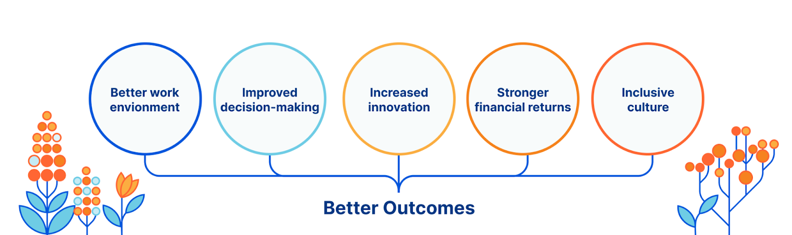
That is why we place a lot of value on the importance of diversity, equity and inclusion. Diversity, equity, and inclusion lead to better outcomes through improved decision-making, more innovative teams, stronger financial returns and simply a better place to work for everyone.
To become more diverse, equitable, and inclusive, we believe it’s important to focus on communities within and around our company.
Building internal communities at Cloudflare
At Cloudflare, like most workplaces, there are built-in communities: your direct team, your cross-functional partners and (because we take onboarding very seriously) your new hire class. These communities, especially the first two, are important to help you get your job done. But we want more than that for our team at Cloudflare. We believe that community builds connection and fosters a sense Continue reading
Introducing Greencloud


Over the past few days, as part of Cloudflare’s Impact Week, we’ve written about the work we’re doing to help build a greener Internet. We’re making bold climate commitments for our own network and facilities and introducing new capabilities that help customers understand and reduce their impact. And in addition to organization-level initiatives, we also recognize the importance of individual impact — which is why we’re excited to publicly introduce Greencloud, our sustainability-focused employee working group.
What is Greencloud?
Greencloud is a coalition of Cloudflare employees who are passionate about the environment. Initially founded in 2019, we’re a cross-functional, global team with a few areas of focus:
- Awareness: Greencloud compiles and shares resources about environmental activism with each other and the broader organization. We believe that collective action — not just conscious consumerism, but also engagement in local policy and community movements — is critical to a more sustainable future, and that the ability to affect change starts with education. We’re also consistently inspired by the great work other folks in tech are doing in this space, and love sharing updates from peers that push us to do better within our own spheres of influence.
- Support: Our membership includes Cloudflare Continue reading
How Employee Resource Groups (ERGs) can change an organization

Employee resource groups (ERGs) are important to a company’s success. They foster community and a sense of belonging, help drive organizational change, and improve the overall quality of an organization’s culture. Most importantly, they help organizations become more diverse, equitable, and inclusive. I’d love to share the history of ERGs at Cloudflare, as well as how they function and help influence the company.
The history of ERGs at Cloudflare
When I joined Cloudflare in 2017, one of the first things I did was search “LGBTQ” in our company chat. A chat room of a dozen or so employees titled “LGBT at Cloudflare'' popped up. There was evidence of some historic chatter in the room, and it was clear some employees had gathered for drinks after work before. I immediately introduced myself to the group, and asked if they would be okay with me setting up a meet & greet event. We booked a conference room, ordered lunch, found an article to discuss, introduced ourselves, and collectively decided we wanted to continue hosting such events. In our second meeting, we decided we should make things official by deciding on a name. This was the birth of Proudflare, our employee resource group Continue reading
Crystal Notes: Modules
Modules in Crystal allow you to group methods and classes together based on related functionality. They provide a namespace to help avoid naming collisions and can also be used to mixin functionality. Module Definition Top Level Variables Modules can have top level variables. Top Level...continue reading
Crystal Notes: Classes
Crystal is a object orientated language. Classes are the blueprints from which objects can be created. Class Definition Class Methods Class methods allow you to add behaviour to a class. Variable Access By default, class variables are not accessible from outside the class. You cannot...continue reading
Crystal Notes: Modules
Modules in Crystal allow you to group methods and classes together based on related functionality. do_stuff(*stuff_and_things)' ) }}continue reading
Crystal Notes: Classes
Crystal is a object orientated language. Classes are the blueprints from which objects can be created. Class Definition Class Methods Class methods allow you to add behaviour to a class. Variable Access By default, class variables are not accessible from outside the class. You cannot...continue reading
How The New Workplace Model Challenges Cybersecurity
With an agile philosophy, IT teams should feel comfortable walking the tightrope between security and accessibility with a zero-trust framework.U.S. DoE Pumps Another $73M into Quantum Future
The U.S. Department of Energy (DoE), the agency with the most sway in how the largest supercomputers are designed and built, has been looking beyond CMOS since well before exascale systems were on the horizon. …
U.S. DoE Pumps Another $73M into Quantum Future was written by Nicole Hemsoth at The Next Platform.
OpenFlow Realities, 2021 Edition
I thought I was too harsh every now and then, but I’m a complete amateur when compared to Minh Ha’s take on OpenFlow.
Indeed Quantum Computing and OpenFlow have a lot in common. They both create stories that have emotional appeal, they both require invention of new physics, and they’re both filled with grand vision, grandstanding, and empty promises. But there’s no shortage of PhDs, high hopes, cash infusion from VCs, and a Cambrian explosion of research papers, many of which content is not even worth the papers it’s printed on.